Schijfcheck
This subject asked us to make an design that was gamified to engage people and maybe even be slightly addictive.
This one will be mostly Dutch but I will add context in English.
I chose to make a dieting app based on “Schijf van vijf”, think food pyramid. Its a way for kids to learn to eat healthy. My idea was to make it a dieting coach app for young adults who grew up with this metaphor.
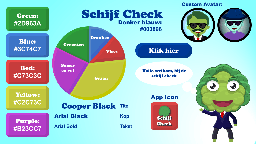
This is the style guide and it uses a lot of the style they used on the posters for the “schijf van vijf”. The character in the bottom I use to take of the edge and give the application a bit more humour so it didn’t feel to serious. In the top u see 2 character icons, these are examples of how u can customize your profile to create a feeling of owner ship.

This is the user flow, here u can see how i expect the user to use my app. It all revolves around its homepage that gives access to all the features necessary for the core mechanics of my gamified dieting app: You can see your progress (goal is to match the diagram), u can can add the items you consumed, see advice given by the guide character, see your profile and how many points u have and earned.
This document explains choices I made to gamify it and how i think it helps my app and why I can justify using addictive elements in my app. ill translate the conclusion here:
Goal of the app: To improve users’ health.
Engagement: The app uses enticing rather than coercive elements to motivate users to continue using it. To entice them, it employs black and white hat core drive elements with a focus on white hat. Epic meaning, Ownership, Development, and Creativity help give users motivation and a sense of building something while focusing on their health. Loss & avoidance and Curiosity drive users to continue using the app and maintain a healthy lifestyle.
Motivation: The risk of addictive features in the app is reduced because it positively impacts the user. I find the use of subtly enticing elements acceptable when chosen to promote healthier living. I believe using white hat elements is a logical way to motivate users. The use of black hat elements is more challenging, but if they enhance white hat elements, it can be beneficial in a positive manner. I think a designer has a responsibility. The designer should consider how users interact with their design and is accountable for unintended outcomes.
